
Creating the Tidy Data Shopping List: Data Modeling Techniques for Efficient Analysis
Milk, Eggs, Data?


In my last post, I compared making an insight to baking. In particular, I stressed the importance of thinking about your technology strategy so that analysts have the right ingredients in their kitchen and don’t need to go down to the farm for eggs or butter. These next two posts are going to talk about data modeling strategies for Data Engineers, Analytics Engineers, and Analysts.
Data modeling is the process of designing and structuring data such that it represents a real-world concept, idea, or entity to the best of your ability to achieve a goal. In layman’s terms, it’s getting your data to resemble the world as you see it, enabling you to learn new things through analysis. If your data doesn’t look like “reality” then you either can’t learn new things or the things you learn are going to be wrong.
Data Engineers and Analytics Engineers’ entire job is to model reality. They need to provide high-quality data to analysts in shapes that are useful to them based on their understanding of what is important to the business and to analysts. In our baking metaphor, data engineers need to know that lots of recipes call for eggs so they need to figure out how many chickens coops they need to fill to satisfy that demand.
I’ve called this “ingredients-making” portion of the data preparation “Data Tidying” after Hadley Wickham’s seminal article on the subject. Wickham outlines the concept of and requirements for tidy data, a “standardized way to link the structure of a dataset (its physical layout) with its semantics (it's meaning).” The main advantage to using consistent tidy data design patterns when creating an analytics layer is that analysts aren’t reinventing the wheel every time they shape data. They can reuse shaping strategies (and even code) whenever they start a new analysis and save their cognitive efforts for telling stories with data. To bakers, no matter the recipe, flour always gets sifted the same way.1
The Tidy Data Shopping List
Wickham asserts that tidy datasets follow 3 rules:
Each variable forms a column.
Each observation forms a row.
Each type of observational unit forms a table.
To understand the above rules, let’s start out by defining the basic physical and semantic structure of a dataset.
The majority of standard data consists of rows and columns. Standard datasets are two-dimensional. This means you can infer two, and only two, pieces of information (called attributes) about each value in your dataset: its corresponding row value and its corresponding column value.2

This limitation of two attributes per value is precisely the reason data engineers need to have a solid grasp of data modeling. To create meaning that is both human and machine-readable, we need to take everything that we know semantically about this data structure, choose what’s important, and flatten it into a consistent structure.
For example, let’s say we know that Company X creates a product called the Widget. The product team has done extensive testing on what color resonates best with their customers and determined that to be red. Pricing has been determined to be $50 by the finance team, as it costs $43.48 to manufacture and the company is looking for a 15% margin.
This narrative is flattened into a data table below:
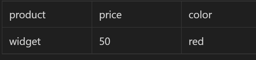
We have structured 3 pieces of information:
We have a product called “Widget”
“50” is a price related to “Widget”
“Red” is a color related to “Widget”
Notice that the information I provided in the above narrative about which teams were responsible for setting each value is not included in this data model. That is the nature of flattening meaning into a model — you will always sacrifice some detail for the sake of structure. When creating tidy data, the goal is to create a structure that maintains as much detail as is needed to satisfy the most common business needs for data. If you need more detail you will need to make your structure more complex and thus increase time to production and cost of support.
Bringing these facts together creates the meaning of the table: “The product called Widget is red and costs $50.”

In this example, the product is an observational unit. Understanding the concept of an “observational unit” is absolutely critical to data modeling. The observational unit is the answer to the question “What Are You Counting?” In this data set, we are counting products and the Widget is the only observation we have (so far) for products. This can also be called a table’s “granularity” or “level of detail.”
Each Type of Observational Unit Forms Its Own Table
We’re going to work through the rules of Tidy Data from bottom to top, starting with Rule #3. Rule #3 states that each observational unit forms its own table. This is to say that each table represents one type of observational unit and information about how observational units relate to each other can be derived using joins.
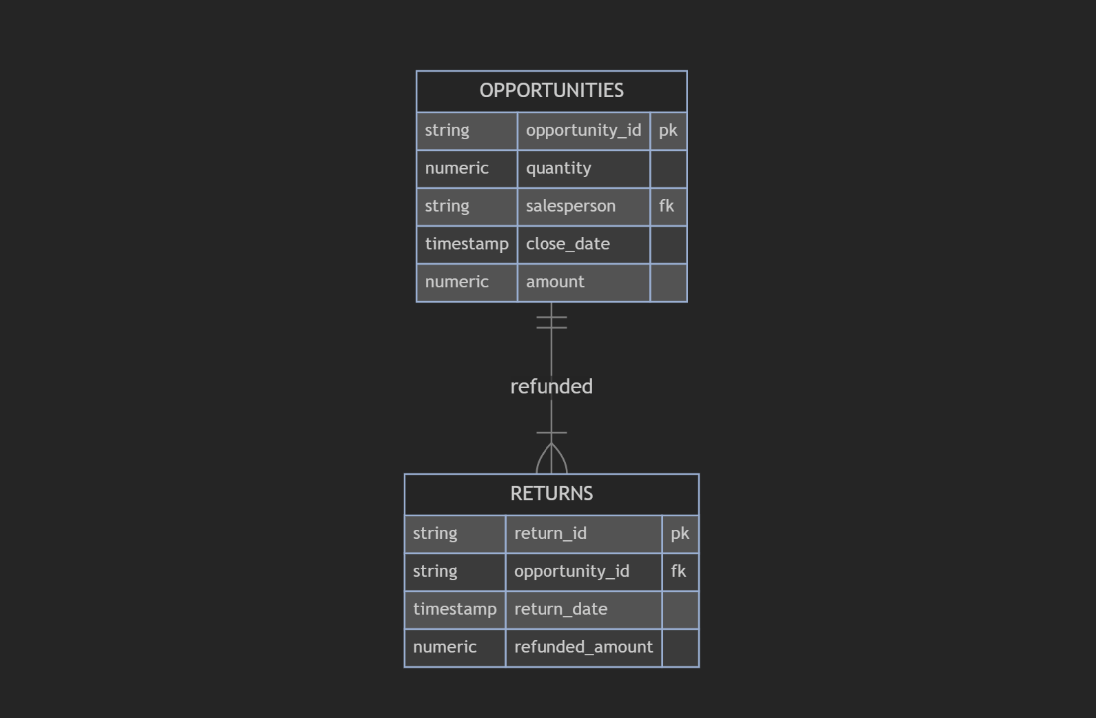
A frequent architectural antipattern I’ve seen are aggregated observational units. These are observational units that are logged in a table that really should be multiple records across multiple tables. Back when I worked in revenue analytics, I saw this as a major data modeling gap in many businesses’ Salesforce instances. They would have great Opportunity tracking, meaning that every time they sold something they could tell me who sold it, when they sold it, and how much they sold it for. However, if what they sold was a bundle of items, they often didn’t link them back to the individual products, making analyses regarding individual products or revenue calculations including refunds for only part of the Opportunity a nightmare to keep track of.
Below is a data model where the products within Opportunities are flattened into a single observation:
Below is the correct way to model it such that each observational unit has its own table:
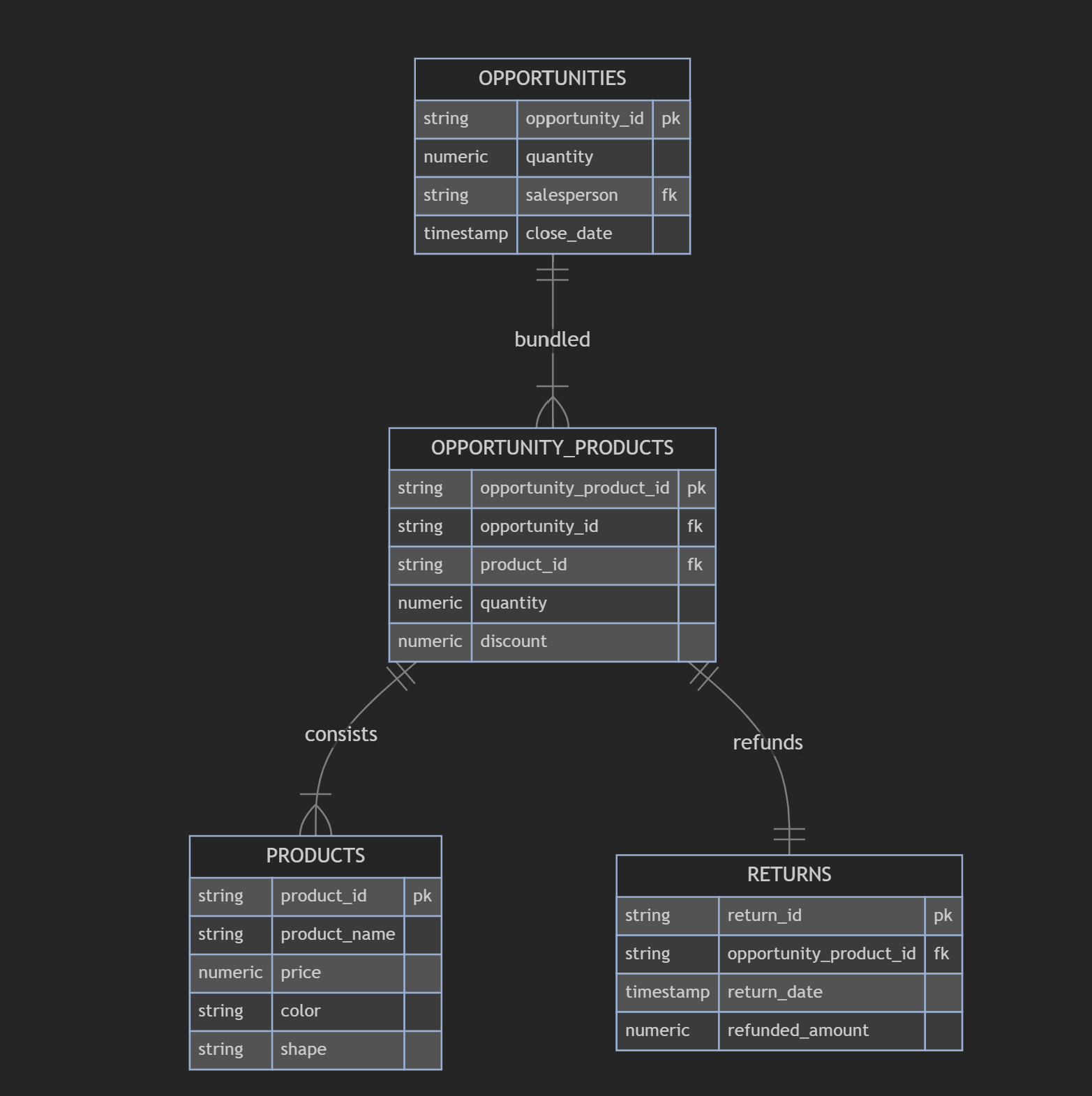
This second data set would allow us to answer questions such as which pages on a customer’s website are leading to individual product sales, which products are getting returned the most, the impact of color on discounts provided, and many more. These are only possible because the data has been thoughtfully disaggregated as a part of data modeling.
Each Observation Forms a Row
Rule #2 states that any additional observation forms a new row within its observational unit table. Any new observation added to a table would increase the count of observations by 1. If a new product was launched, this would be added as a new row to the PRODUCTS table, not the RETURNS table. Likewise, each observation must be complete. You cannot add a new color or a new price to the PRODUCTS table without identifying what product it is attached to (the primary key). You can’t have half an observation.
The most frequent antipatterns here are aggregated observations, duplicated observations, and incomplete observations.
Structuring new observations as rows allows for the analysis of aggregates. This means that numeric values in rows can be grouped and compared across groups in ways columnar data cannot. To demonstrate, I’ll add a few more observations to the PRODUCTS data set.
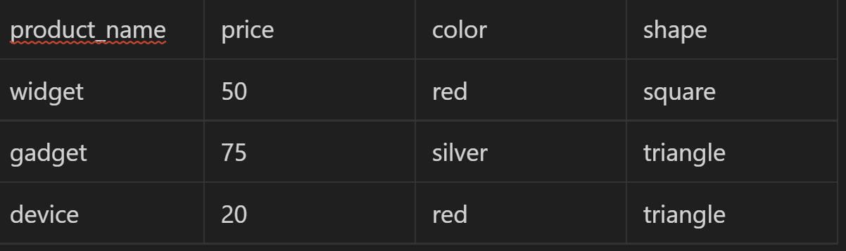
This data allows us to compare the average prices of products by the group's color and shape.
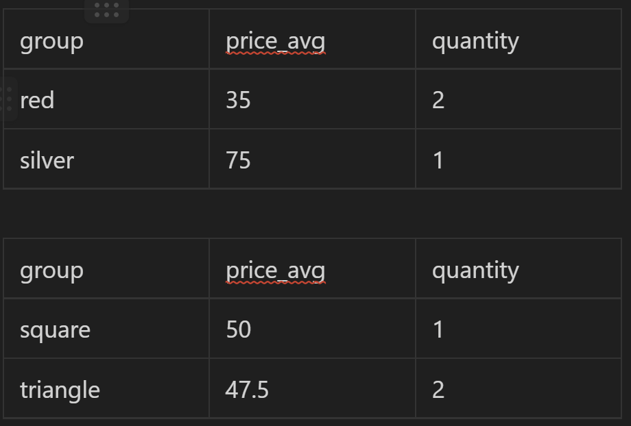
From this limited and deeply flawed analysis, we can learn that color has far more impact on product price than shape. This is only possible because each PRODUCT is entered into a table as its own observation.
Each Variable Forms a Column
Understanding that an observation happened isn’t enough. We need to know specific standardized values about each observation so we can understand how those qualities influence other qualities (as seen above). These qualities are called variables and are tracked in the form of a new column value for each observation.
Variables come in two forms: dimensions and measures. Dimensions are strings that tell us specific qualities of the observation. The ‘color’ variable on the PRODUCTS table tells us if an observation is red or silver. Measures are continuous numbers that tell us something quantifiable about the observation. ‘Price’ on PRODUCTS can be any number and can be used in analysis to figure out what other variables in the observation make the measure go up or down.

The only strict antipattern here would be missing data or incorrectly standardized data. What forms a useful variable for an observation is one of the key strategic items that a data architect needs to decide on. Data architects need to understand the business and the kinds of analyses being performed deeply enough that they can develop in-depth requirements for what data to collect to fulfill the highest impact needs.
From there, rarely does tracked data come in the form of a variable for an observation. Most technology systems create data in the form of event logs which will come in a “long” format. This format can be particularly tricky if it assigns multiple values to a single observation’s variable. Other observations are tracked as slowly changing dimensions and need to be transformed into master data for analytical use. Data architects need to decide the best way to flatten this data into an observation-variable structure through transformation so analysts have ready-to-analyze data.
This thought process is also important when Data Engineering teams need to support Data Scientists. For machine learning models, feature engineering is the process of identifying and developing the variables needed to input into a machine learning model. Machine learning models in production will need to rely on data transformed by Data Engineers, so architects, engineers, and data scientists must work together to determine which variables need to be available in tidy data tables.
Finally, a special kind of dimension variable can be attached to an observation called a “foreign key.” Foreign Keys are values that match values on other tables so they can be joined to each other. I always recommend having every relevant foreign key on each observation so it is easy for analysts to join observations to other observations during the data shaping phase.
In the Waiting Line
Data modeling is an necessary evil. There is no perfect data. There will always be weaknesses, missing data, or thing that are just plain wrong. However, you can build robust capabilities that allow analysts to address the majority of day-to-day analyst use cases.
The tidy data pattern as identified by Hadley Wickham is one of the best structures for data engineers and analytics engineers to use when making data available to analysts. Tidy Data uses the physicality of two-dimensional data to implicitly express key semantics about data. Standardizing the way data is available reduces the amount of toil that analysts need to endure to get to an insight by automating the transformation of important data patterns at scale and reducing the cognitive costs required for analysts to get value from data.
In the final post of this series, we will be taking the ingredients home from the grocery store and into our kitchen to bake some delicious insights for our stakeholders! I’ll be sharing key patterns for taking tidy data and shaping specific data models fit for analysis
It’s also much easier for engineering teams to integrate a dataset into a data product or other part of the Enterprise Architecture if all data is provided to them consistently and predictably, but that’s outside the scope of this article series.
Other data structures are not relational, but those are outside the scope of this article series.
Appreciate the thought that went into this. The brilliance behind Hadley Wickham‘s ideas around data processing are brilliant. Awesome to read about his Tidy Data concept and its influence on how to properly preprocess data so that it’s useful to analysts and data scientists 😎